
Primary Logo
This brand was created for a dietetics graduate who wanted to make nutrition feel more accessible, friendly, and full of life — a refreshing change from the polished, exclusive feel of traditional “wellness” branding.
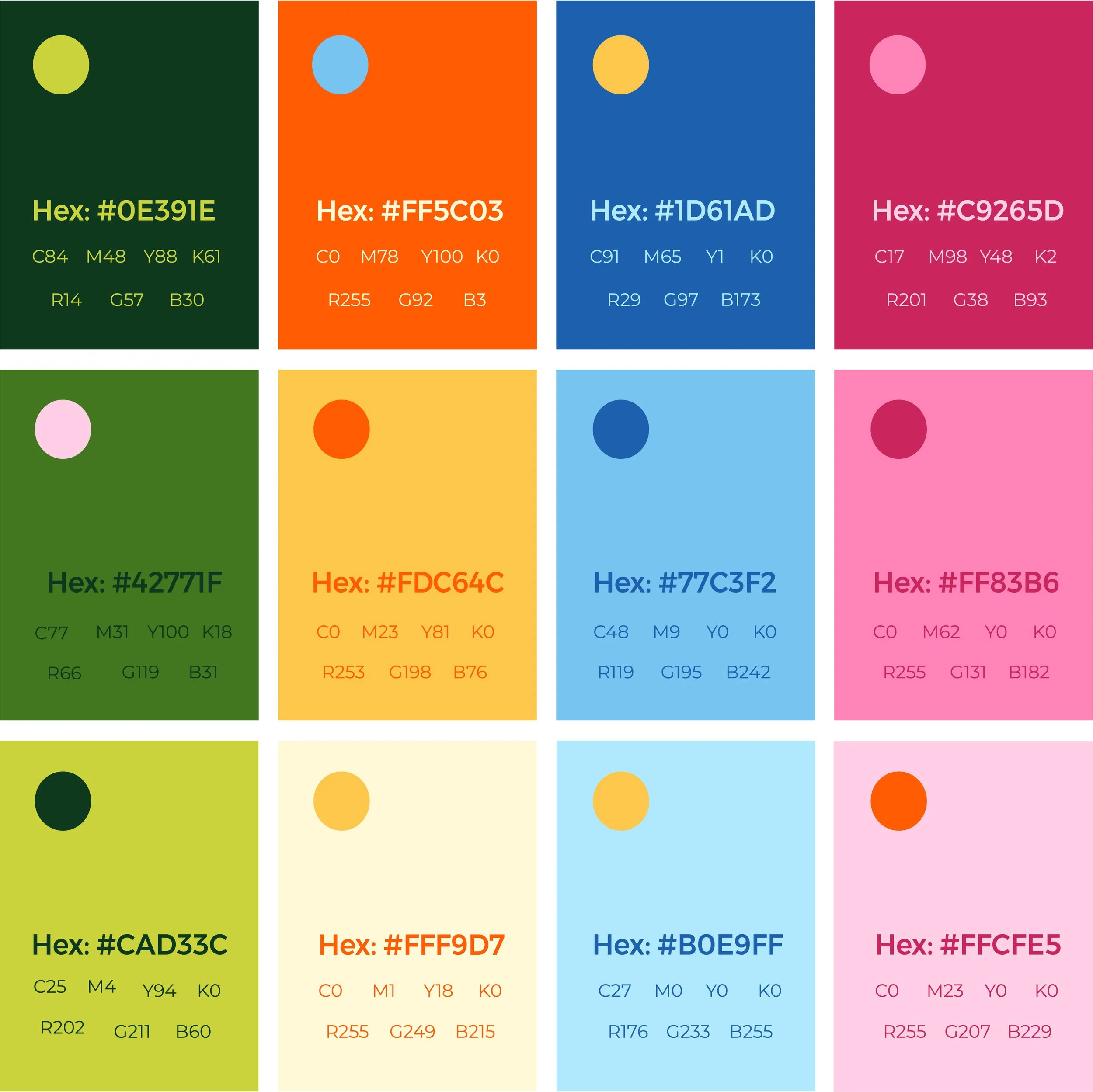
The visual identity is bright, positive, and energetic, bringing warmth and encouragement to a topic that can often feel negative or overwhelming. Round business cards were chosen to stand out — playful, pocketable, and memorable, like something you’d want to keep rather than toss away. The warm, uplifting colour palette reinforces the brand’s mission: to make nutrition approachable, fun, and genuinely feel-good.

Secondary Logo
